When we buy dried herbs and spices, we don’t buy them in jars. We buy them in pouches because they’re cheaper that way (no jars to pay for, right?). Once a pouch is opened, the contents are transferred into small spice jars, and the rest is vacuum-sealed.
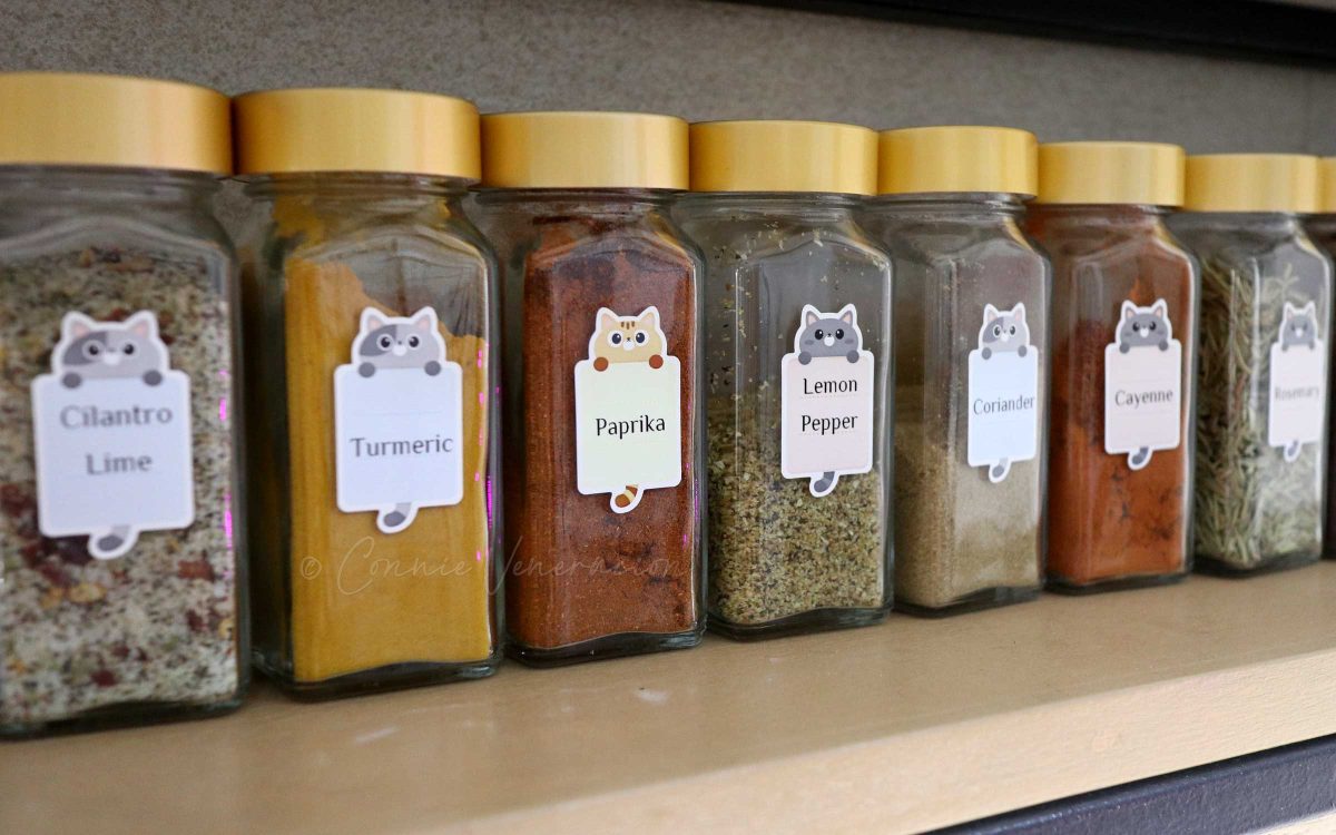
The spice jars are labeled so we know exactly what’s in them. See, we keep supplies of South Asian chili powder, cayenne, sweet paprika and smoked paprika, and it can get confusing because they are all red! Do we really want to open all jars every time we need one red-colored spice and smell the contents of each to determine which is which? Of course not. So, we label the jars.
Label the jars, not the caps
I used to browse Pinterest a lot for all kinds of ideas and inspiration (“used to” being the operative phrase here). I’ve seen so many spice and herb jar labeling styles on Pinterest and some are really gorgeous. Some DIY bloggers even offer free printables that you can use. The problem is that most of them are meant for the jar caps. So pretty yet so useless. Might work if your herb and spice jars are meant as a showcase. But if you’re a real cook, it’s not very smart.
Why? What’s wrong with labeling the jar caps? Nothing. IF you label the jars too. But if you only intend to use one label per jar, stick it on the jar and not the cap. Why?
If you actually cook, you know that there will be times when you will have three or four or more different spice and herb jars open on the counter top. Unless you’re the type of cook who’s as cool as a cucumber like Ina Garten, things can get confusing especially when you’re in a rush. So which is cayenne again and which is paprika? Is it really the best time to be sniffing the contents of the jar one by one?
Worse, when you’re putting away everything, you’ll be the scrambling to identify which cap goes with what jar. Why not do away with the confusion? If you’re using uniformly-sized jars, a cap is a cap is a cap. So, again, label the jars and not the caps.
Useful is the standard. “Pretty” is just an accessory.
On Pinterest, I’ve seen photos of spice jar labels that are, well… Obviously STAGED to make a visual impact rather than offer real value. Soooooo pretty but, sadly, pretty useless too.
For example. Labels with white cursive text on black background. Spidery cursive text at that! Really? Are those labels really for kitchen organizing or for photography? Personally, I like pretty but I abhor useless more than I like pretty.
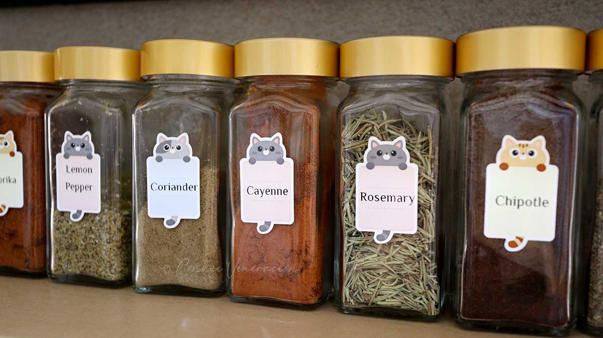
It makes better sense if the labels are easy to read. No spidery cursive text and the font size large enough so you don’t have to squint to read the text.
You don’t need special equipment to make effective jar labels. If aesthetics don’t count, a strip of masking tape with the name of the product written on it using a waterproof marker will do.
If, however, you want something that’s more pleasing to the eye, try Niimbot label printer (no, this is not a sponsored post). It’s inkless, it uses waterproof and smudge-proof thermal label paper, you can select the font and adjust the font size. It’s operated and controlled through an app that you download on your phone or tablet.
If buying a gadget for the sole purpose of making labels sounds impractical or over-the-top, try sticker paper cut out using a craft puncher. You can design the label on your computer and print it out. To make the label waterproof, allow the ink to dry for several hours then paint over with crafters glue like Mod Podge. You can wash your jars before refilling without worrying that the label will come off.
Updated from a post originally published in January 8, 2018